Hey pvdl, thanks for the post - coloured fonts are not natively supported and we’ve discussed it now and think, because of the design ethos of discourse, it’s not worth the work or a positive change to be adding. I’m sure people can formulate posts and points with the font options.
Yes pls change it so the quote box background color contrasts nicely with the post one is writing. I would suggest a color like yellow not a grey. Pls change it because most people will use the default light theme.
Just to be clear. I cant see why the addition of a donation button on the forum homepage would hurt anyone. Nobody visits the regular homepage, thats why its important.
A fancy propeciahelp.com is nice, but is it effective in getting us where we need to be? One major concern is the continued survival of the foundation and thats why a constant reminder to set up a recurring monthly donation schedule is highly important. I have already done this sadly few people have followed suit.
I had a look to see if I could change the quote background colour and it doesn’t appear customisable and is standard across Discourse. I talked with a few others and they didn’t see that colour as a problem (in fact some people have very strong views against recolouring), so I’m sorry if that’s a personal dislike - I’d suggest using the dark theme if it’s giving you trouble with the contrast.
Re a donation button, thanks for the feedback. We’ll discuss it further with you guys when we can.
Another feedback is that one should be able to have standard text align options found in most word programms.
Also one two more suggestions:
- can we reintroduce signatures (i.e some message at the bottom of ones posts thats always the same).
- For new studies that need funding we should have a special mention below the regular donations button (that links to a funding thread). My opinion. We need to be more effective in organising funds both when it comes to concrete studies but also generally with recurring monthly donations.
The software we use (Discourse) has a strong focus on quick moving online discussions. Anything that distracts from that purpose is not supported. This includes sophisticated formatting and wild colored fonts. Signatures, like you suggested, are considered very “old school”, distract from the conversation flow, and are not supported either. I don’t know about you, but I by far prefer the clean minimalist look of Discourse to the way the forum used to look and work.
@axolotl and myself are working on integrating the donation aspect you mentioned. It will be a lot cooler than just a link. Stay tuned.
I am very happy to hear that you are working on the donation aspect, hopefully integrated into this forum and not (only) on the main website (propeciahelp.com), which nobody visits in any case. That is probably one of the most important aspects and improvements possible for this forum.
I understand that the minimalist idea doesnt vibe with the signature suggestion. Formatting text however (especially the standard text align stuff and coloring options) enables more readable posts. Coloring in red blue green and standard align options I think would be an improvement.
It will be fully integrated with forum, and I am sure you’re going to love it. Standard Discourse supports Markdown for formatting. You can find a guide here. If you can’t find what you are looking for in that list, we (Discourse) can’t do it.
A coordination with the foundation would probably be beneficial.
Could everyone please update their profile and let us know what you took by filling out the “Substance” field under Preferences.
Thanks
done! however it took me 1 minute to figure out where i have such an option since im new to this forum so id suggest an admin pm’s everyone with detailed instructions on how to set it
Click on your icon and then on your profile

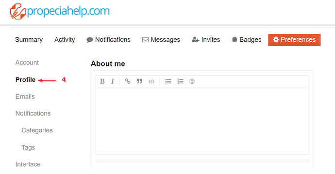
Click on Preferences:
Then click on Profile
Now scroll down a little, and you will see the field “Substance”. Select the appropriate value from the dropown list. You can also fill out the other fields such as “About me” and indicate in what country you live by selecting your national flag (all the way at the bottom of profile). This way, users from your country can get in touch with you, if you would like that.
Done. Good idea for data collection.
When posting references to scientific articles, please always post the pubmed link when available. This site has functionality which will then render a pubmed article like this:
The rendered summary of the article is much more useful to the reader than only a link.
Enjoying the new look site! Great work, Awor & Axo!
Welcome to our international users 

Over the years, propeciahelp has developed into a truly global site. Well over a thousand users visit us from all over the world each day. To better accommodate our international friends, we have now implemented a translation feature on this site. To use it, please proceed as follows:
- go to your profile as described here: Propeciahelp site news and feedback thread
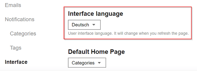
- make sure that the “Interface language” setting is set to your language:
- If your language is now set to something else than English, you will now see this globe symbol:

If your click on it, you will see a translation of the post. Even though we are using state of the art artificial intelligence and machine learning services, don’t expect a really great translation for what we are discussing on this site 
Have fun, and we hope that it will help our international visitors to better follow the conversations!
This is just plain awesome!
Is there a way to change to heart (love) reaction to a like (thumbs up) reaction? The current one is not appropriate to use after a depressing comment, even if I like the comment. Many times I don’t “like” something because I think it is inappropriate to “heart” it when someone is describing their dire straights. Other times I want to express my support for a post but the heart is simply not the right way to do it.
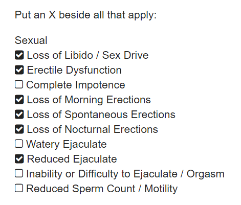
Our site just has gained another cool feature: Interactive checkboxes for member story symptoms. This will allow the user to easily revisit and revise the symptoms posted in the member story, thereby keeping it up to date.
If the member story was filled in correctly in the first place, it should now look like this (excerpt of sexual symptoms list):


